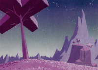
Maurice Noble worked as a background artist for Chuck Jones at Warner
Bros. from the 1950s into the 60s. His style of layout perfectly
matched as well as balanced the characters of Looney Tunes by mimicking
their essence of insanity but maintaining a quieter presence in order to
keep from distracting.
Noble's backgrounds were geometric and simple. Some parts of the background contained detail and pattern but these details faded off the further an object was in the distance.
The shapes of his designs resembled the shapes of the characters quite closely; the long swooping curves as well as the sharp and jagged geometric lines resemble the likes of Daffy Duck and Bugs Bunny. His backgrounds also created a sort of desolate feeling; the Looney Tunes characters were typically in their own world and extra characters were few and far in between. The backgrounds had a feeling of solitude and a sense of deranged wackiness which matched the whole theme of Looney Tunes quite perfectly.
Let's see it in play in this short excerpt from Duck Amuck:
The backgrounds in this short are wacky and jagged, mirroring Daffy Duck's crazy personality with its wild colors and angular shapes.
Here are a couple of shots from towards the end of the Animation. In the first one, Daffy is in a mall setting on a sunny day. Notice how far away from realism the design is and even farther away in the shot below.


No comments:
Post a Comment