Here it is! It’s definitely still a work in progress; I intend to revisit and add in the scenes I had to cut out with the interest of time. Fortunately, I animated the pivotal scenes before the transition scenes so the story more or less holds it’s shape.
Monday 18 January 2016
Captain Character - Dave’s Turnaround

Here he is! This is the first turnaround animation I have ever created. It was quite difficult to keep track of the perspective changes. I’m not entirely happy with it, but here it is nonetheless!
After our green screen induction, I was able to create a turnaround for the plasticine version of Dave. Due to some time restrictions, I was unable to attend the second half of the induction, which is why Dave is hanging out on a dark blue backdrop.
Friday 15 January 2016
Termite Terrace
1923, four brothers created an animation production company that would become a source of great inspiration and entertainment to millions. Albert, Harry, Sam and Jack Warner opened Warner Bros. Studios in 1923. A pivotal member of their team, Hugh Harman created Looney Tunes and Merrie melodies (1930/31). A few years after that, a handful of creative geniuses began a collaboration in a wrecked old building on the Warner Bros. lot they referred to as ‘Termite Terrace’. Starting out with Tex Avery, Chuck Jones, Bob Clampett, Mel Blanc and Robert Cannon, Termite Terrace grew to over two hundred creatives. During this time, Termite Terrace created comedy gold. At the time, short animations would be sold to move theatres in a package. This transaction was referred to as ‘Block Booking’. The animators had quite a lot of creative freedom and created stories, characters and situations that they wanted.

The aesthetic of Warner Bros. was quite opposite from the likes of Disney. Many of the animators at Warner Bros. either came from Disney studios or left to work there. The ‘Termite Terrace’ was a sharp, tongue in check and sarcastic contrast to the sweet, round and friendly appearance of Disney. Not to mention, the humour of Looney Tunes and Merrie Melodies typically had a dark or mean streak to it.
Because the prominent form of 2D animation at the time was hand crafted and painted on cels, Looney Tunes and Merrie Melodies cartoons had a raw and scratchy aesthetic as well as angular and edgy shapes.
Sources:
https://www.youtube.com/watch?v=3YjvSo12xDU
Emile Cohl
Emile Cohl (1857) was French cartoonist and is known as "The Father of the Animated Cartoon”. He is also known to have brought with him stop motion to America.
Fantasmagorie (1908) is ‘considered the first fully animated film ever made’ wiki. It spans two minutes and is made up of 700 drawings. The word Fantasmagorie is defined as “a constantly shifting complex succession of things seen or imagined.” [indingdulcinea.com.] The entire animation is a sort of ‘stream of consciousness’ [findingdulcinea.com]. It seems as though Cohl was experimenting with what he could do within animation. His technique was to trace each drawing based on the previous one creating a continuous flow and movement. Although the film is a hectic and eager exploration of the possibilities of a new world discovered, at the time the footage was astounding if not frightening.
‘The puppets nightmare’. Emile Cohl plays and experiments with the physics of his characters by completely flipping upside down and abstracting physics. He stretches and squashes the characters, changes their anatomy, and even turns them into inanimate objects. His transitions between shots are very aesthetically clever, for instance, at some point he turns a man into a ladder. His lines and flow are quite genius and there is an abstract and random, slapstick humour to his work.
Animation in the Digital Age
In the late 1900s, after a long dry spell, theatre attendance suddenly spiked. Internet was flourishing and the population had an even more intimate relationship with entertainment as it was constantly at their fingertips. The internet also provided an attractive new platform for distribution. Making a video Viral was a cheap and simple way of spreading information incredibly quickly and effectively.
This is the era during which traditional forms of animation began to slip to the backs of our minds with a budding interest in technology replacing it. Production had become the most affordable it had ever been with programs anybody could afford and learn to use. More and more people were experimenting with animation which meant a lot more talent potential.
In 1986, Steve Jobs bought LucasFilm studio from George Lucas and the legendary Pixar was born. Pixar’s professional and artistic goal was simply to develop a high standard of computer technology and use it to convey beautiful stories. And they have achieved just that. To quote John Lasseter, the man also known as the father of Pixar, The thing I wanted to do in Luxo Jr. was make the characters and story the most important thing, not the fact that it was done with computer graphics. – John Lasseter. John Lasseter is a master storyteller as well as a master animator which is why, even in the 80s and early 90s when computer graphics was not as sophisticated, his short stories were touching and relatable. Here are two examples of one old animation by Pixar and one new. The storytelling quality maintains it’s excellence while the technology catches up. Still, let us not forget how impressive and attractive 3D animation looked in the 80s when used by Pixar studios.
The difference in technology is quite drastic and no doubt an improvement, however the storytelling quality is just as brilliant in both short films. Pixar’s films, in my opinion are brilliant for many reasons, chief of them being that the characters are relatable and carry human characteristics and flaws many of us can find in ourselves.
Animation in the Film Age
At the turn of the 19th to the 20th century, a multitude of creatives from around the world were already experimenting with the earliest forms of animation. In 1895, Alfred Clarke accidentally discovered stop-motion with the subtle idea of stopping the camera, changing something on the set and turning the camera back on. In 1888, Charles-Emile Reynaud created the fist projection animation. One of the most ground-breaking animations, however, was this discovery of stop-mostion by a British film maker.
A Cameraman from St. Albans by the name of Arthur Melbourne Cooper created a very important advertisement in the year 1899. Melbourne Cooper directed an animated ad for Bryant and May matchsticks asking viewers to donate towards a fundraiser with the purposes of sending free boxes of matches to troops. With the use of thin wires and camera equipment, Melbourne Cooper brought life to inanimate objects, stunning the population. Following Matches - An Appeal, Melbourne Cooper produced several creative films such as `The Enchanted Toymaker’ (1904) and 'Dreams of Toyland' (1908).
Sources: http://ukanimation.blogspot.co.uk/2012/12/the-matches-appeal-dispute.html
Animation in the Television Age
The late 20th century brought a close to what many call the ‘Golden age’ of animation with the introduction of home entertainment. Theatre attendance dropped dramatically and block booking became obsolete. As a result, budgetary constraints were tightened at animation studios such as Disney and Warner Bros. Many artists were let go from their jobs and turnaround became much more stringent. Although there were many negatives to these changes, new opportunities were also made available; there was now a demand for animation for television, advertisements and television series’. However, the quality of animation began to quickly decline as they were needed frequently and in large quantities. There was less emphasis on detail and quality and more on reproducibility.
The 50s was a turning point for animation. Although the quality had declined, what replaced it was an edgy and modernistic aesthetic that many of us strongly associate to cartoon network. Hanna-Barbera, one of the more prominent production companies of the 50s was at it’s prime with a growing demand for series animation. Hanna-Barbera is responsible for many successful cartoon series such as Yogi Bear and The Jetsons.
"Hanna-Barbera was the first animation studio to successfully produce animated cartoons especially for television; until then, cartoons on television consisted primarily of rebroadcasts of theatrical cartoons.” - aaacaricatures.com
 
Because television did not offer the same kind of budget offered by theatres a few decades before hand during the Golden era, Hanna-Barbera had to consider cutting costs at every opportunity which they accomplished through the clever consideration of limited animation. Everything from the backgrounds to the character movements was reproducible and reused frequently. Characters were even designed in a way that made them the easiest to animate and would take the least amount of drawings to animate. Although Hanna Barbera limited it’s animation for quick production, they maintained a very high standard of animation. "It was like a religious experience to see a show that was fast, noisy, modern and - as it seemed to me - incredibly sophisticated.”
Undeniably, Hanna Barbera thrived successfully in a time when animators and production companies would have been expected to suffer. "And because of what we were doing, the entire business came back to work again.” - Barbera http://news.bbc.co.uk/1/hi/entertainment/6193603.stm
Sources: http://news.bbc.co.uk/1/hi/entertainment/6193603.stm
http://www.aaacaricatures.com/hannabarberacartoons.html
|
Thursday 14 January 2016
The Other Side - Animation Part 3 Short cuts!

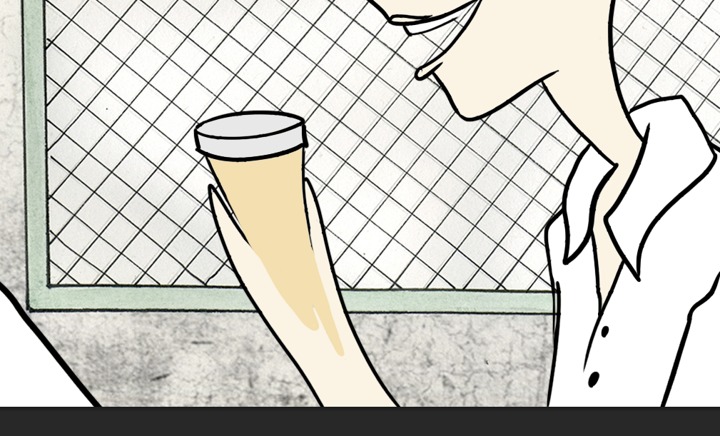
In this scene, the nurse puts her hand away to retrieve the pills from her pocket. In order to make it look like her hand is speeding up and blurring through action, I used the 'smear animation' technique to blend the two frames together.


Same in this case, in order to emphasise the nurse's surprise, I smeared the transition between the two frames. I got this idea from a Documentary on Chuck Jones, 'Extremes and In-Betweens - A Life in Animation'.
Monday 11 January 2016
The Other Side - Animation Part 2

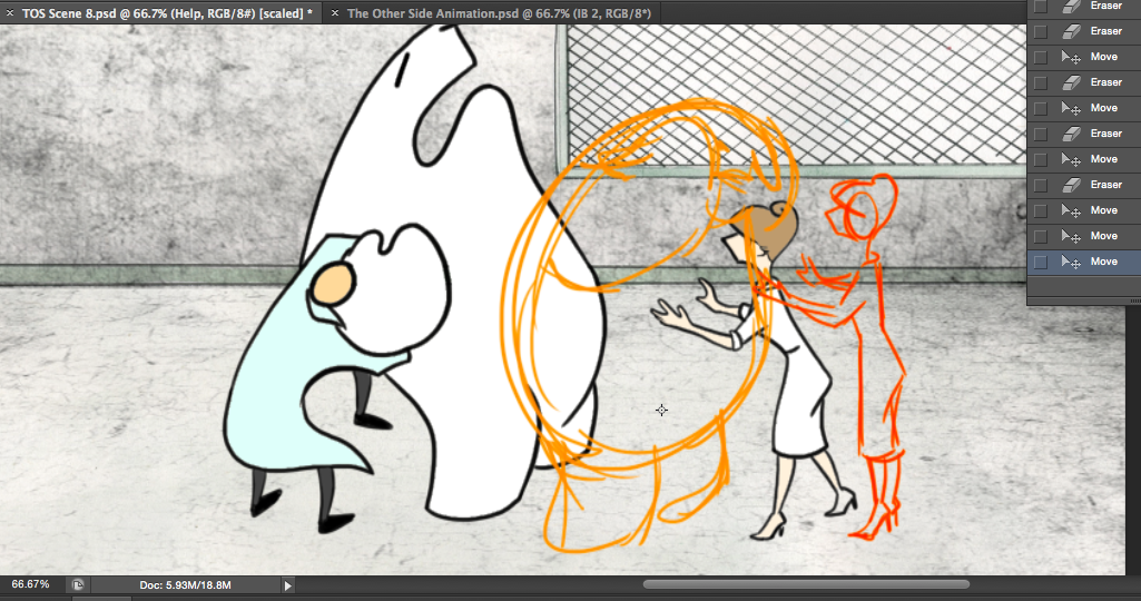
Most of the shots from my animation involve character interactions. This shot was the most difficult to animate as it involves not two, but four characters and a physical struggle. There are multiple simultaneous movements indicating actions and reactions between characters. So to keep track of each character, I created three layers in Photoshop, one for each character; The nurse (red), Billy (yellow), and the hospital workers (green).


For each frame, I sketched my characters in action on their individual and separate layers to see how the movements and arrangements play out. The advantage of having each character on a separate layer is that if I want to change the orientation or location of a character, I can easily move them around within their own layer.
Once I am satisfied with the sketches, I select the layer I had intended for the shot and trace the final positions. After this, I fill the color in immediately. I decided at the beginning of this project that I want to get the animation done in one go instead of revisiting to color each frame. Another advantage of coloring straight away is that it made it a lot easier for me to identify the volume of my characters through Onion Skin.
_____


For this shot, I struggled most with trying to figure out how to arrange the sink so that it can be in front of Billy but at the same time, behind his arm. After fumbling around awkwardly for solutions, I came up with on that will most likely be replaced by a much better idea in the future. All I did was out the sink on it's own layer and place it first before all of the other layers
I took advantage of a few of the 12 principles of animation throughout this project. Here is one example of Squash and Stretch


Arcs! Billy is pulling a water basic from the concrete ground. To plan out the line of action for the water basin, I drew out arcs from point A to point B. I had a separate layer for Billy as well as a separate layer for the water basin. In the picture directly above, you will notice that the In-between sketches (red) are closer to points A and B instead of the center position. This is because I wanted the action to speed up a lot in the middle and slow in and slow out.

After the scene was complete, I noticed how quickly Billy moved. I thought it would be much better to slow down the first part of the shot as Billy prepares to pull out the basin. I stretched the moment Billy is pulling away at the basin to three frames worth. Then I added another frame/layer in which I stretched out Billy even a bit further.
Here is the scene:


The Other Side - Animation - Layer Organization

This is how I organized my layers for Pose-to-Pose animation. The first row of layers are the key poses, the following rows are the In-Between frames.


In order to see my frames clearly through Onion Skin, I start by placing the key frame layers back to back. Then, I separate them and create another video group and place layers in between the key frames. I continue with this method for every new video group I add. If you look at the image above, you can see how I manage to keep track of the order of my frames. I select the first row (all but the very first frame) and move it to the side, then I select the next row and arrange it right under the first row. I do the same for the remaining rows. After every frame has been moved to the side, I create a new video group with blank layers. I proceed to drag back the old layers one by one, making sure to arrange a blank layer between each one. Annnnddd....

Ta-daaaa!
Wednesday 6 January 2016
Captain Character - Character Sheets

Dave, 3 quarter, front and side view.

Facial expressions: I do feel that he wouldn’t stray far from the first one but it is good to explore a range.

T - Pose.

Action Sheet.

Color Swatches.
Captain Character - Refinement

My character Dave is about 3.5 head heights. He has a high nose, low glasses, low mouth and high ears. His head is almost perfectly a square, maybe slightly longer vertically.
After some experimenting, I came to the conclusion that Dave has a very limited pallet of expressions. He is the type of character that expresses himself through actions as opposed to facial expressions. When I stretched his face into different extreme emotions, he completely lost his identity. I thought of more subtle ways to convey his emotion, through the shape of his glasses and the placement and shape of his mouth.
Color

I wanted very neutral colours for Dave as he has a boring office desk job and doesn’t have much of an imagination. I went with neutral bluish pants with dark grey shoes and tie.

For his face, I wanted to do a very light grey wash but that made him look a bit like a robot. To add a touch of human quality, I mixed in a very small spot of red. His face still looked washed out but with a touch of life. To top off his facial aesthetic, I added a plumy red to his nose with the intention of making him look sickly as if he had a cold.
With these refinements set, I am moving on to the character sheets!
Subscribe to:
Posts (Atom)