Friday, 20 May 2016

Applied Animation - Evaluation

   
The last few modules have been quite stressful for me. In the span of two months I have had to make the difficult decision to leave my course due to some unavoidable and unfortunate circumstances, ultimately contributing to my rushing the final modules (COP, Applied Animation, PPP. I can’t say I’m too proud of my work for Applied Animation as I think I could have done a lot more if had had more time and if I had managed the time I had more efficiently. On the brighter side, this module has been a great learning experience for me; I have become more comfortable with Adobe After Effects, I have had the chance to play around with Maya and I got a taste of what it would be like to work as a freelance Animator. 

Our first studio brief was an introduction to the basics of Maya; Learning any new program can be frustrating and Maya has been the most frustrating out of any program I have learned to use in the past. I think one of the biggest reasons for this is that working in a three dimensional space is something I am not used to. However, when I did get the hang of it I really enjoyed the process. The modeling exercises were particularly exciting especially the texturing. However the walk cycle was definitely more challenging, as I would often find myself stuck on one minute detail for a long period of time unable to carry on without getting through the obstacle. It certainly tested my patience, however I do now have a better understanding of animating using Maya.               

One of the best aspects of this module is its close imitation to professional freelance work within the design industry. Working on a project that has specific constraints set by a client opens up many creative possibilities. With a project like this I find myself challenged as a creative to come up with effective solutions to set problems. I also found myself working a lot more quickly in the production stages of the project than I ever have before. Of course time constraints had a role to play however it was decision making that ultimately caused error in my work as opposed to human error in terms of the practical creation of it; because I was making decisions quickly on the spot, I would realize only retrospectively that I could have done something more efficiently or differently for a more accurate result. These reflections are documented in my production diary on my blog.                  

One of my biggest regrets for this module is my lack of experimentation. I don’t feel as if I have pushed myself into unknown territories enough and the only feelings of uncomfortability I felt were that of pressing time as opposed to the uncomfortability of a creatively risky endeavor.  Although I did create my first animation using After Effects, I felt I could have done something more adventurous around the topic of National Geographic.  And I am quite pleased with my concept for the Hallmark Ident however I have grown to be too comfortable with traditional 2D animation. For future projects, I look forward to experimentation as well as strengthening my practical skills as an Animator.   

Maya Study Task 2 - Moom Walk Cycle

The Maya walk cycle was pretty straight forward. There were a couple of minor issues I ran into for instance Moom’s knee got stuck in this position:


And I couldn’t figure out how to fix it. Eventually I ran out of time and after half an hour trying to fix the knee I gave up and exported the images. This is something I will have to revisit later on. Otherwise, using Maya is becoming a bit easier. It’s just like learning any program for the first time, the first few tries I wanted to tear my hair out but once I got the hang of it it became quite enjoyable. Manipulating Moom and becoming accustomed to the different commands did not prove to be too difficult and of course Mat’s step by step instructional videos were quite informative. Here is my walk cycle, besides the weird knee thing on the 22nd frame, I think it looks okay. 


Hallmark Final Animation

I still consider this a work in progress even though I am handing it in today at noon. There are a few things I would like to refine in the animation such as creating a smoother transition with the rotating flower as well as tweaking the overlapping action in the first scene. I would also like to add some movement to the final scene. Nonetheless, here it is:


Thursday, 19 May 2016

National Geographic Final Animation

After fumbling around in After Effects like the beginner that I am, I was finally able to complete my animation with the help of Brenda and Alex. I think I will refine it even more after I hand in as the more I get used to the tools the more I realise I can do to improve the piece but for now, it will have to do.

I have decided to create a dark charcoal background as well since the National Geographic Channel website has a black background.

In terms of the footage, I went to the National Geographic Youtube channel and picked out some footage, stringed it together in Premiere and imported it into my AE project. The sound I got from incompetech.com, a track entitled 'Prelude and Action’ which I cut down in premiere. Here is the final(isn) result:


Wednesday, 18 May 2016

Hallmark - Production - Scene 2

In order to make the process more efficient, I copied, pasted and scaled up the flower and bee from the first scene. Then I traced them onto the key frame layers.


When the flower turns her head to face the bee, I used the perspective transform tool and tilted the left side of the flower (in the hidden layer) forward and traced the result into the key frame.

Hallmark - Production - Scene 1

I have narrowed down my storyboard to three scenes: The flower waving in the wind with the bee approaching, then a close up shot of the flower kissing the bee and the third scene will be the shot zooming out to reveal the Hallmark Logo.

The first think I did was import the Hallmark logo and blow it up so that only bits of the 'H' and 'a' could be seen.

 Animating the waving flower was a little more difficult than I anticipated. Taking into consideration slow in and slow out effects as well as the overlapping action was a lot to focus and in retrospect I think I should have animated the body first and gone back to animate the overlapping leaves. Too little too late, I animated it all at the same time! I got through it with some personal video referencing:
 

Frame set-up:

In terms of arranging the Key a and in between frames, I had to take a different route than my typical method of animation. I arranged the key frames as well as the first two in between frames in more of a straight ahead fashion in between the keys. I found it easier to capture the flow of the flower using this method.


The Bee:


Boy was this embarrassing. My intentions were good, however I had to readjust this scene many times. I created a separate layer to draw a path for the bee to follow when he approached the flower. On that same layer, I circled the key frames (orange), and the in betweens (green, blue). I wanted the bee to have a roller-coaster effect when traveling. What you see above is my second attempt at arranging the circles. After the third, I realized I should simply animate straight ahead and that was when it worked. 

Lastly, I thought I would lower the opacity on the Hallmark logo to give it a more background feeling as well as add a soft pink background to give it a sweeter aesthetic.

Here is the first scene completed:


Saturday, 14 May 2016

National Geographic - Production in After Effects

This is my first real attempt at After Effects so I did have to refresh my memory with some Youtube clips about pretty simple things like setting up compositions, importing files as well as fiddling around with and manipulating my Assets.

I imported my assets into AE and followed my paper edit storyboard. Using the slow in and slow out effect really made the biggest difference as the objects looked too mechanical when moving at a consistent pace.


One Issue I had was that my assets would pixelate when they were scaled. I went online to figure out how to prevent this from happening. As long as the little sun symbol is active, the objects will remain rasterised. The website I pulled this from is below:


Here is my first draft:


Something I know I would like to change is the transition between the laptop and the iPad so that it looks like the Laptop is closing and opening into an iPad. it might also be interesting to rotate the object horizontally as it closes.

I also tried using a dark grey background which actually looks really nice. It would also be quite consistent with the website as the website does have a dark background with white type. This means I would have to change the colour of the type for the logo. Mmmh...


I will continue to tweak and refine my project tomorrow. The next step would be to find some video footage of subjects pertaining to the National Geographic Channel and importing them into my project. My plan is to use a clipping mask to contain the footage within the objects I have animated.

I also have yet to find a soundtrack to my Ident! I am imaging something adventurous and rhythmic..

National Geographic - Pre - Production - Assets

Today I began playing around with some of the brand colors and shapes for the Ident. I created some assets in Adobe Illustrator to animate in After Effects. I am not yet sure if I want the transitions between the devices to be through rotation, growth/shrinkage or both.

Here is my paper edit storyboard for an idea of the flow and transitions of my animation:


I had three colours to play with; yellow, black and grey. I didn’t want to add any colours because these three hold each other together very well. I created a prototype with  grey background as well as a white one and I definitely prefer the white.
Instead of animating the video content within the devices, I thought of finding some footage that would highlight the topics of National Geographic Channel and using that within a clipping mask as the device containing it shifts warps and changes.

Friday, 13 May 2016

Maya Study Task 1 - Cell Phone

For my Maya object I created a cell phone based on that of my own. First I created a thin and flat rectangle. In order to create a dent on the face of this rectangle, I selected the face and extruded it inwards. After this was complete, I created a second and thinner rectangle as the screen of the cell phone.

One of the reasons I created the screen separately was to use the Boolean tool to extract and carve out the speakers for the phone.


I beveled the edges of the phone, including the long edges on the back of the phone creating a softer edge. This was quite easy as I am becoming more and more familiar with creating and manipulating shapes. 

Final product:

Once the body and appendages were built, I moved onto texturing. I changed the texture of the screen to something more glossy as well as changing the colour.

For the screen, I added a glass effect making it see through and then imported an image and placed it just behind the screen.


These images are screen shots from Maya as as soon as I attempted to capture pictures of the phone, the screen image would disappear. Here are my saved photographs from the project:


Maya Study Task 1- Truck Modeling

Getting used to Maya was not an easy task. The program is by virtue quite difficult in that there is a lot more involved in working in a three dimensional space as opposed to a two dimensional space. A lot of the time I was sure I had a certain object at a certain space but I was wrong. It was also a bit of a headache getting used to using the tools and the platform but that is true for any program that is newly being introduced.

 
Edges, vertices and faces 

WER: W - move along the grid in a straight line
E - rotate
R - scale

Having a Homomorphic and perspective
 view of my work made it a lot easier to keep up with where my objects were and where they needed to go.

 Thus I began building a truck. It wasn't too difficult to follow Mat's tutorial although I did need his help a few times. Like I said before, the difficulty came mainly from my unfamiliarity with the program.

Here is my truck:


Friday, 15 April 2016

National Geographic - Development


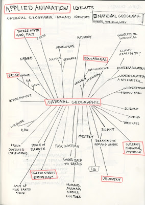
These are the key words associated to the National Geographic channel. I noticed that the channel’s shows and content cover three broad themes: current day events, historical events, and debunking of mythology.


My initial idea was to incorporate rectangular shapes as different modes of technology ie. television, laptop computers and finally mobile phones. These rectangular symbols will change and rotate as an animation moves past the screen. I have not yet decided what this animation will be, but the goal is for it to strongly communicate the three aforementioned themes of the channel. Finally, the camera will pan out and the rectangular devices will simply become a vertically stood yellow bordered rectangle as the words ‘National Geographic Channel’ fade in next to it.

Hallmark - Development


I began the project by identifying the Hallmark brand. On the left are all the words I found to have a strong association to Hallmark, in particular the Hallmark channel. On the right, I began some rough story ideas.


Because Hallmark represents sentimentality, family, romance and connection I decided to take a romantic route. I thought of two characters: a bee and a flower that fall in love and share a bashful kiss. The main reason I chose a flower and bee is because it seems to be a recurring theme on the Hallmark channel. 


My designs for the flower began quite simply. However, the more I iterated the aesthetic the more the flower came to subtly resemble a woman. The bee is quite small in comparison to the flower, so he is ultimately a little more simple. The final chosen designs are shown below in rough sketches:


After the two share a kiss, the camera will pan out to reveal the Hallmark logo with flowers growing on the letters and bees flying around it.


This is a very rough storyboard for the Ident. The interaction between the bee and the flower will take approximately seven to eight seconds long while the panning out will take two seconds. The heroin flower will be perched on the right side of the letter ‘H’ of Hallmark.


Wednesday, 30 March 2016

Hallmark - Brand elements


The Hallmark channel has distinct characteristics of romance, connectedness and sweetness. The site is family orientated and many of their shows, films and content seem to be aimed at family centric people, most likely women from mid twenties to their middle ages.


The colour palette includes complementary colours of Pink paired with Teal and Red paired with Green. There is a general presence of summer as most of the imagery resemble flowers, bees and wind wheels.


This is an example of an animated Hallmark logo at the end of a movie premier on the Hallmark channel. The flowers twirl and spin as the bee flies across the screen leaving a trail that resembles sewing stitches. This simple and small element adds a quality of authenticity and homeliness to the brand.