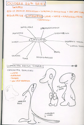
Choosing this theme was not very difficult. Lateness is a flaw I identify within myself and wish to correct and what better way to embrace and improve than by creating an Animation of it? So I began to brainstorm the concept of 'Lateness'.
Brainstorming:
I set about designing a character first. I wanted something with the characteristics that so often go along with Lateness: disorganized, weak, panicked, frantic.
I went through a few character designs until I settled on the right one. Initially, I wanted a lanky creature with a long and wobbly neck but I realized that with so many moving appendages, my time constraint as well as the limitations of my animation skills, I had to settle for the smarter choice and create a character that is round and compact so that the animation will not be too complicated.
In addition to the character, I decided to have him carry a few objects that constantly fall out from under his arms. I was hoping this would help emphasize the characters lack of organization as well as reinforce the idea that he may be failing to uphold a certain responsibility, for instance, delivering a bunch of balls to a very important meeting.
Planning:
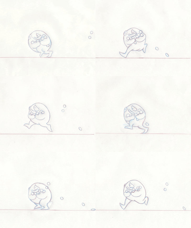
I made sure to plan out my key poses. I had 12 frames per second and I wanted my character to switch feet at least twice per second. Initially, I planned to have 6 poses to one running cycle: the first contact point, the transition point, the 'Mid-Air' point (what I called it), then the next transition point, contact point, and finally the Squash point. I very soon realized that I didn't want my character to be leaping, rather jogging quickly which means he would remain relatively close to the floor. So I cut out the 'transition' poses and was left with Squash, Contact, Mid-Air, Contact, Squash which equaled to 4 frames per cycle making the character run 3 times per second.
Testing:
Using pose to pose Animation on transparent sheets of paper, I marked out my key poses. I wanted my character to be running quickly so I didn't create many in between frames. I also wanted to see if the nose was flopping in harmony with the rest of the body and motion. Overall, I created 8 frames and duplicated them in Photoshop to create an infinite loop to get a good idea of what the little guy looks like while running.
After I was satisfied with the running cycle, I went back and added in the balls. Because I wanted the animation to loop, I made sure that the balls looped back to the very first frame. I am not very satisfied with the addition as it proved to be difficult to control the falling balls because of the rate at which the character was moving away.
The next step will be to implement more into the story such as the character looking at his watch as well as nervously looking behind him at the objects he is losing. I would like to ultimately keep this animation as a loop.
_________________________________________________________
Here is a refined storyboard:
After running a few more tests, I was ready to render my animation. I simply outlined it with black fine liner and added a little bit of colour to my character’s nose to make him look a bit more pathetic.
I realized (a little too late) that the ball that ultimately trips the character appears to be a lot heavier and stiffer than the rest of the balls. This is because as it makes contact with the floor, it does not squash a lot and it stays completely still as the character trips over it. Something to keep in mind for the next time!


No comments:
Post a Comment